Design system
Vision Design System
Siemens Digital Industries Software, a unit of Siemens, specializes in 3D & 2D Product Lifecycle Management software.
Vision is the official Design System for Siemens Digital Industries Software, created as a guide for marketing platforms, sites, and general online presence. It aims to bring consistency to the overall user experience, reduce design revision time, and bring a self-service approach to building web pages.

Why we needed a design system
Overview
We needed a design system because there were inconsistencies across different digital channels, such as marketing platforms, client-facing e-commerce platforms, and communication emails. The company was shifting towards a component-based and self-service approach. In addition, we had redundant and inconsistent documentation. To understand the real challenges, I conducted two types of internal user research with all stakeholders.
Identifying Pain Points
I conducted semi-structured interviews with internal stakeholders such as Front-end developers, content writers, marketing/branding team, and product/project managers to understand their pain points regarding accessing and managing design components, design tokens, and content guidelines.
I aimed to analyze their every touch point with design components and understand their motivations, frictions, and their goals.
I interviewed a total of 15 members and gained detailed insights regarding the process from ideation to implementation of new design components.

Few responses from user interviews
Surveys
Along with semi-structured interviews, I also carried out surveys with 100 stakeholders to understand the most important friction points and what features they would love to see in the future solution.
Platform: Conducted via an online survey tool (SurveyMonkey).
Participants: Internal stakeholders who directly or indirectly design and use UI Components, branding/marketing material, and write content for web pages. That included front-end developers, content writers, marketing/branding team members, and project/product managers.
78%
Front-end Developers reported Inconsistencies in design elements
58%
Project managers reported delays due to design-related issues
62%
Front-end developers indicated spending major time in implementation
84%
of stakeholders indicated there is redundancy in design and implementation process.
90%
Marketers indicated a need of streamlined process
Approach
1. Defining core principles
To guide the design system's development, we established a set of core principles. These principles aimed to ensure a consistent and user-friendly experience across all digital touchpoints.
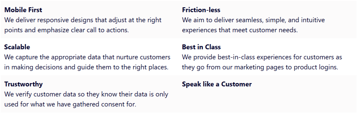
These principles served as the foundation for all design and development decisions, ensuring that the design system met the specific needs of Siemens DISW and its users.
2. Creating foundation
Establishing a strong foundation was crucial for the design system's success. We began by defining the core visual elements:
Logo
Color
Typography
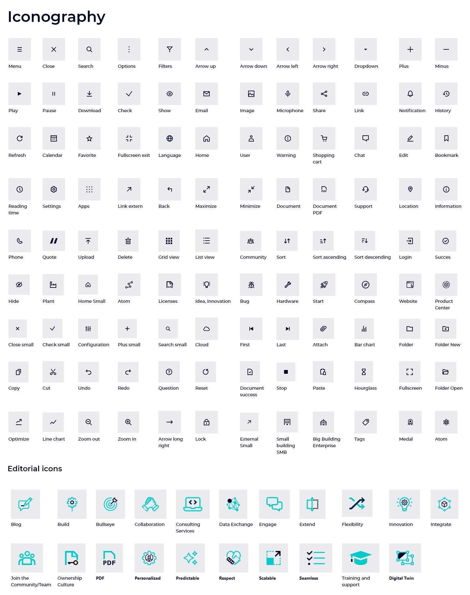
Iconography
Accessibility
Imagery
Motion
Illustrations
These visual elements served as atoms for the development of the component library and ensured a cohesive and consistent user experience across all digital touchpoints.
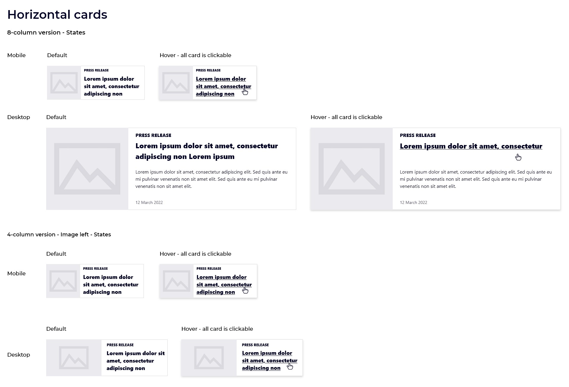
3. Building component library
A key element of our design system is a comprehensive, reusable component library that includes UI elements such as buttons, input fields, navigation components, data displays, and feedback mechanisms.
To ensure usability and maintainability, each component has detailed documentation divided into four sections:
Design: Usage guidelines, anatomy, and layouts for web and mobile.
Tokens (Code): HTML, CSS, and JavaScript code from Storybook platform
Tips: Clear suggestions for non-technical users.
These visual elements served as atoms for the development of the component library and ensured a cohesive and consistent user experience across all digital touchpoints.


Example of component documentation
4. Documentation
We utilized the Zeroheight platform for clear and accessible documentation of our design system.We utilize the Zeroheight platform for clear and accessible documentation of our design system.
Zeroheight is a dedicated tool for documenting design systems, offering features such as strong integration capabilities, version control, and powerful search functionality.
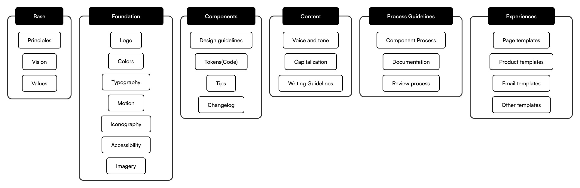
Documentation structure of Design System
Shots of Design System


Conclusion
4 ways to measure success
Design System Adoptions
Integrating Zeroheight with Google Analytics enabled me to track valuable metrics like the frequency of design token usage, instances of copied reusable code, and downloads of design assets. This data allows for swift calculations to assess the time and cost efficiencies achieved by the design system.
Efficiency
I tracked the duration from component ideation to execution. Through an optimized review process involving designers and developers, we notably minimized the time spent on development revisions.
Consistency
I assessed the consistency of user experience and visual elements across various channels by conducting surveys with the target audience.
Collaboration
A few months post-deployment of the design system, I conducted stakeholder interviews to gather insights on their perceptions of both the design system and the collaboration with other team members.